

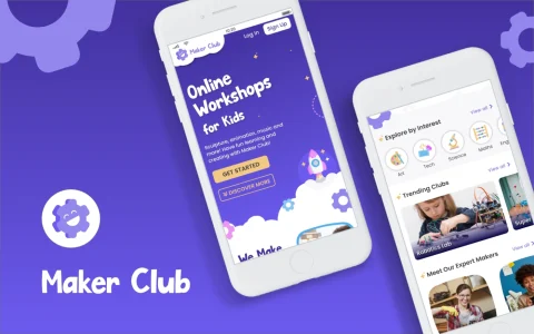
Case study: GETMOVIN'
A Figma UI project
Create a modern fitness app's UI from scratch
Approx. 9 weeks part time
Solo project as part of the CareerFoundry UI specialisation course
Figma for wireframing, prototyping and all other deliverables
01 | Overview
Project background
GETMOVIN' is a responsive web app prototype for scheduling and following workouts at home.

Objective
I was required to create the overall design for this web app, including the style guide and clickable prototype. I was provided a brief, including persona description, and some brand guidelines to follow.
Feature highlights
Below you can see a sneak preview of some final mockups which showcase the web app's core features. These highlights show the general scope of the project and the overall design direction.
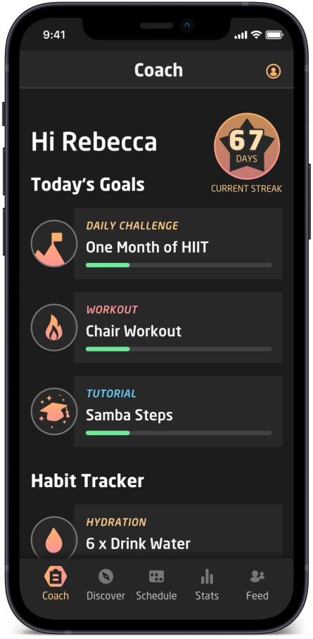
Dashboard coach
See today's plan and progress.
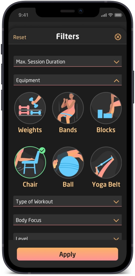
Visual filters
Find workouts tailored to your needs.
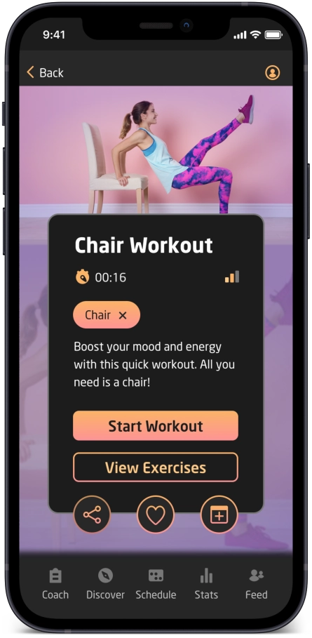
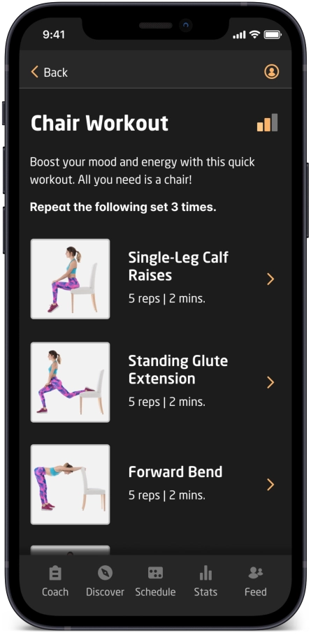
Workout summary
Share or favourite a workout.
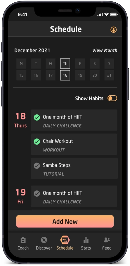
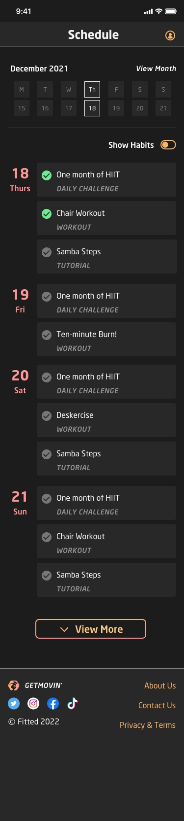
Set your schedule
Create a customized fitness plan.
Learn the steps
Discover the correct techniques.
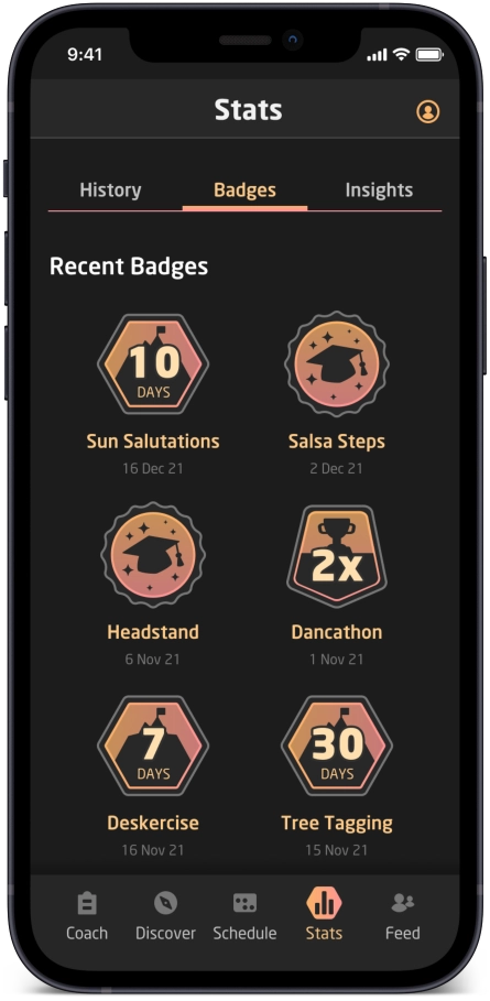
Collect badges
Complete workouts, tutorials and challenges!
Project rationale
When I read the project brief, I immediately drew comparisons with edtech products - and with a background in educational publishing, I love edtech! At first glance, a fitness app might not seem like an edtech product, but I observed the following parallels:
Guide beginners to learn new exercises and workouts.
Learn new skills, moves and healthy habits.
Personalize a plan to get fit and complete daily workouts
Methods to motivate including streaks, badges, stats and insights.
The user: Rebecca
Understanding user needs
Several characteristics of the persona resonated with me (sedentary work, long hours), but I think everyone can relate to this persona. Finding the time and motivation to exercise is challenging, especially with added limitations such as lacking outside areas, living in a small apartment and sharing the space with flatmates or family.

"I love the thought of something that could really work with my schedule. Being as busy as I am makes it tough to exercise otherwise."
Vision for differentiation
Home use only
This app is not for use in the gym or outside. All the exercises can be done with just a few basic, easy to find or low-cost items (mat, chair, yoga blocks, belt, bands, etc.).
Variety of workouts
The app combines a variety of approaches including HIIT workouts, dance steps, tutorials and optional fun daily, weekly or monthly challenges to encourage the user to move around more and develop new skills without feeling like a chore.

Healthy lifestyle goal
The web app also includes healthy-habit forming and tracking to connect exercise with the bigger goal of a healthy lifestyle. This reminds users that our food choices, water intake, sleep and other factors are also important when striving for fitness.

"As a frequent user, I want to be able to schedule exercises for working out, so that I build positive habits."
User stories
I was also provided some user stories for the persona. This information and the persona details helped me understand the user, and I was able to prioritize the most essential features.
- As a new user, I want to learn about different exercises, so that I can figure out what is best for me.
- As a new user, I want to be shown how the exercises are done, so that I know I’m doing them correctly.
- As a frequent user, I want to be able to schedule exercises for working out, so that I build positive habits.
- As a frequent user, I want to be able to earn achievements or rewards, so that I can stay motivated.
- As a frequent user, I want to complete daily challenges, so that I can have an additional way to stay motivated.
- As a frequent user, I want to track progression and record what I’ve done, so that I can see my progress over time.
- As a frequent user, I want to be able to share routines with my friends who may also be interested, so that I can encourage them to become healthier.
User flow
By focusing on the user stories, I was able to create a user flow that could accommodate the requirements of the persona. Here you can see the main tasks and how they can be achieved from the first screen.

02 | Develop
The design process
From sketches to high-fidelity
I began by sketching about 20 screens based on the user flow I had established.
First wireframes
I began by sketching about 20 screens based on the user flow I had established.
After that, I used Figma to create very basic layout blocks for each screen. Although the layout blocks may seem simple, I found this step very beneficial as it helped me identify repeated areas (such as headers, footers and workout cards) and think about how these could be represented by components and autolayouts in Figma. Doing this early on saved time in the long run.
Then I created low-fidelity wireframes in Figma for each screen and added protoype interactions.

UI elements
Modals, tab bars and more!
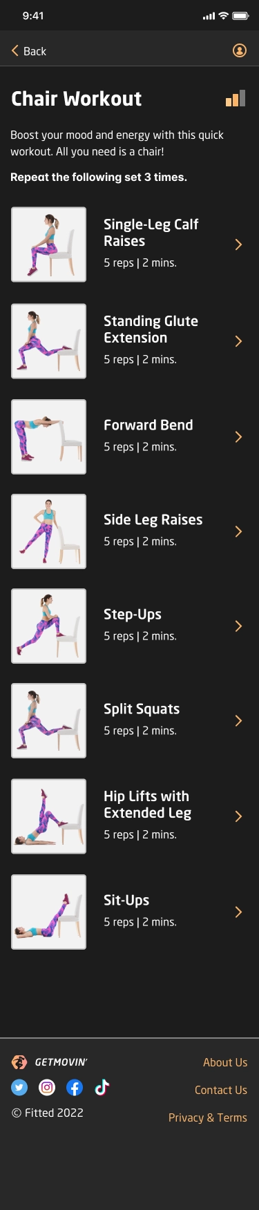
In most screens, I utilized a number of familiar UI elements including modals, chips, a dashboard area and opportunities to share or favourite a workout.
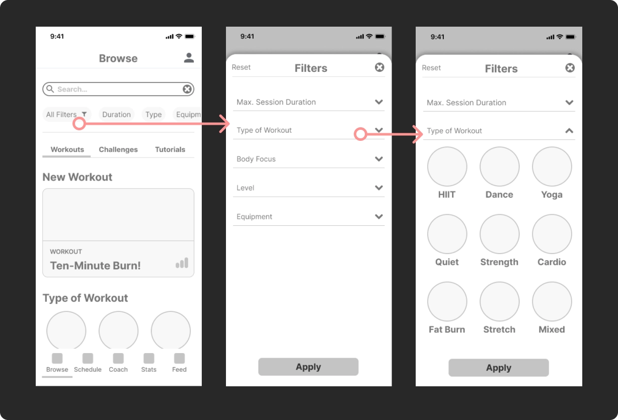
Filter and accordion
Selecting filters brings up a modal with accordion dropdown options. The accordions let users see a collapsed list of options at a glance.
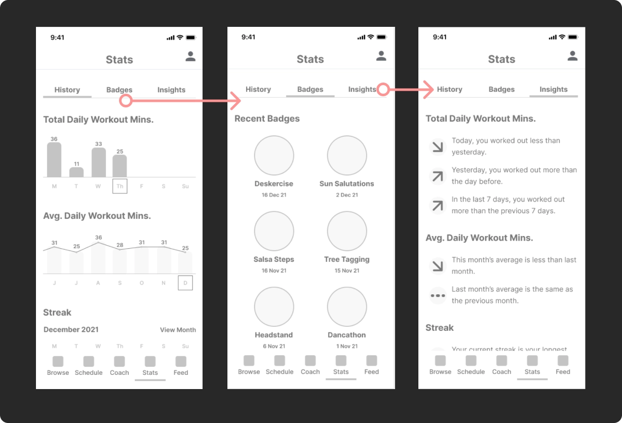
Visual progress
Problem: How might we make the raw data meaningful and easy to understand?
Achievement UI patterns include progress charts, which give the user visual feedback and are motivational. Streaks encourage users to maintain a daily habit of exercise. A bar chart and line graph help to differentiate the first two reports which represent two kinds of timelines (short term accurate numbers and long term averages).
Badges are used to reward the user for completing tutorials or challenges. Insights have arrow icons to indicate downward or upward trends.
Mood boards
Before adding colours and typography to the design, I thought about the tone and atmosphere of the app and revisited the persona. Rebecca, a software developer, and other people who need to focus on screens all day for work often experience eye strain, so I felt dark mode would be a strong benefit.
At this stage, I created two mood boards and selected this one as it conveys energy and power. The grayscale variations contrast with coral, orange, pink and gradients in-between and these colours could work in a dark theme. I want to evoke a sense of fun and liveliness, but also determination. The fiesta atmosphere turns the chore of exercising into a party!

Iterations
Dark theme
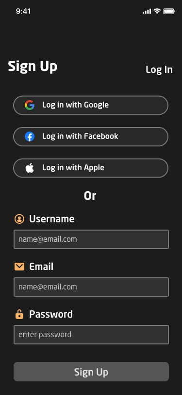
As I ramped up to high-fidelity, I made some changes to the original plan. I decided to show the web app in dark theme as default (settings could switch to a light theme if needed).
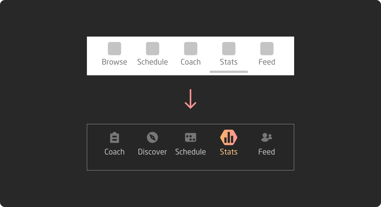
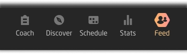
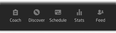
Navigation
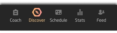
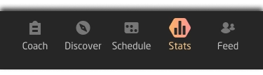
I realized the naming and order of items on the bottom navigation bar needed revising, too. I made Coach first as it's a kind of dashboard so it's logical to be first. I also opted to remove the bottom highlight line to show the active button with imagery instead.
03 | Deliver
Design considerations
Accessibility
When building the colour palette, I used contrast checkers to make sure text and elements were clear and easy for all users to see.
Responsiveness
I also scaled up the mobile wireframes to tablet size and desktop size so that I could adjust the layout accordingly.
Feedback
I shared the prototype with some peers and got some comments that helped shape the final design.
Style guide
The style guide is included below and includes the colour palette, typography, UI elements and other necessary details about the design.

Style guide


Gallery
Take a look at some of the screens below. Keep scrolling for the clickable prototype.

SCROLL


SCROLL

SCROLL
SCROLL

SCROLL
SCROLL
SCROLL


Clickable prototype
Access the clickable prototype for GETMOVIN' below.
04 | Evolve
Next steps
User metrics
With more time on the project, gathering user metrics would be useful and further development of all screens at different sizes is also needed.
Evaluation
In this project I learned how to create icons from scratch using keylines and Figma. I would like to spend more time honing this skill. I also learned how to use Figma after using AdobeXD previously. I found the power of variants and autolayouts in Figma extremely useful.
Design credits
I created the icons, moodboards, screen designs and all UI elements, but some illustrations were obtained from www.freepik.com and Storyset.