
Case study: Maker Club
An end-to-end UX project
Design a responsive web app following a user-centred approach
Approx. 5 months part time
Solo project as part of the CareerFoundry UI specialisation course
Over 50 research participants recruited for interviews, surveys and user testing
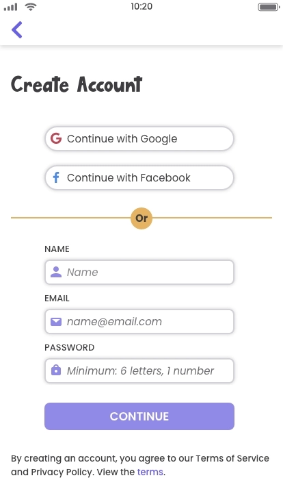
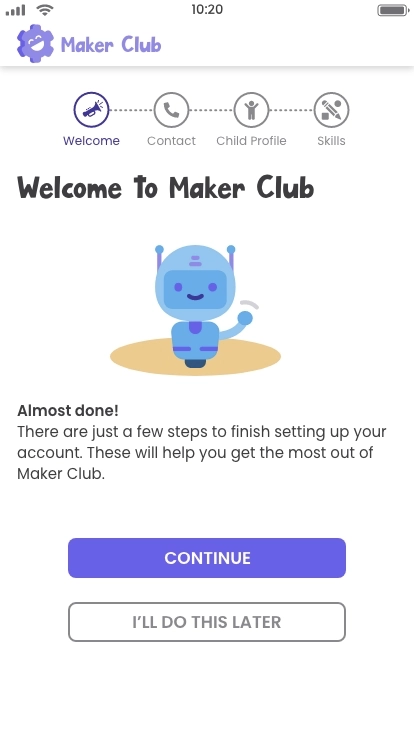
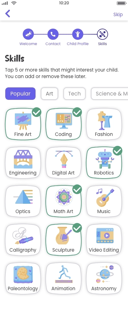
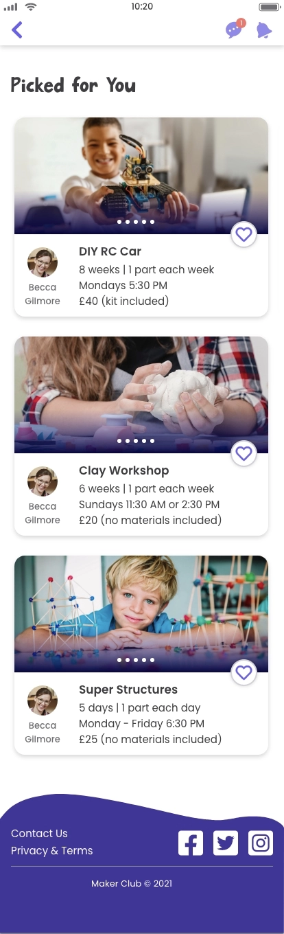
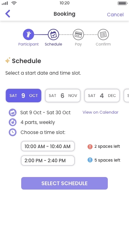
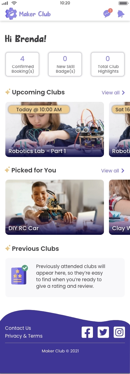
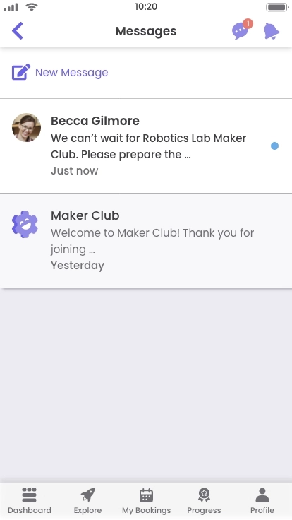
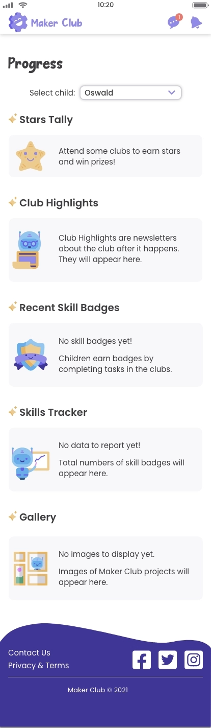
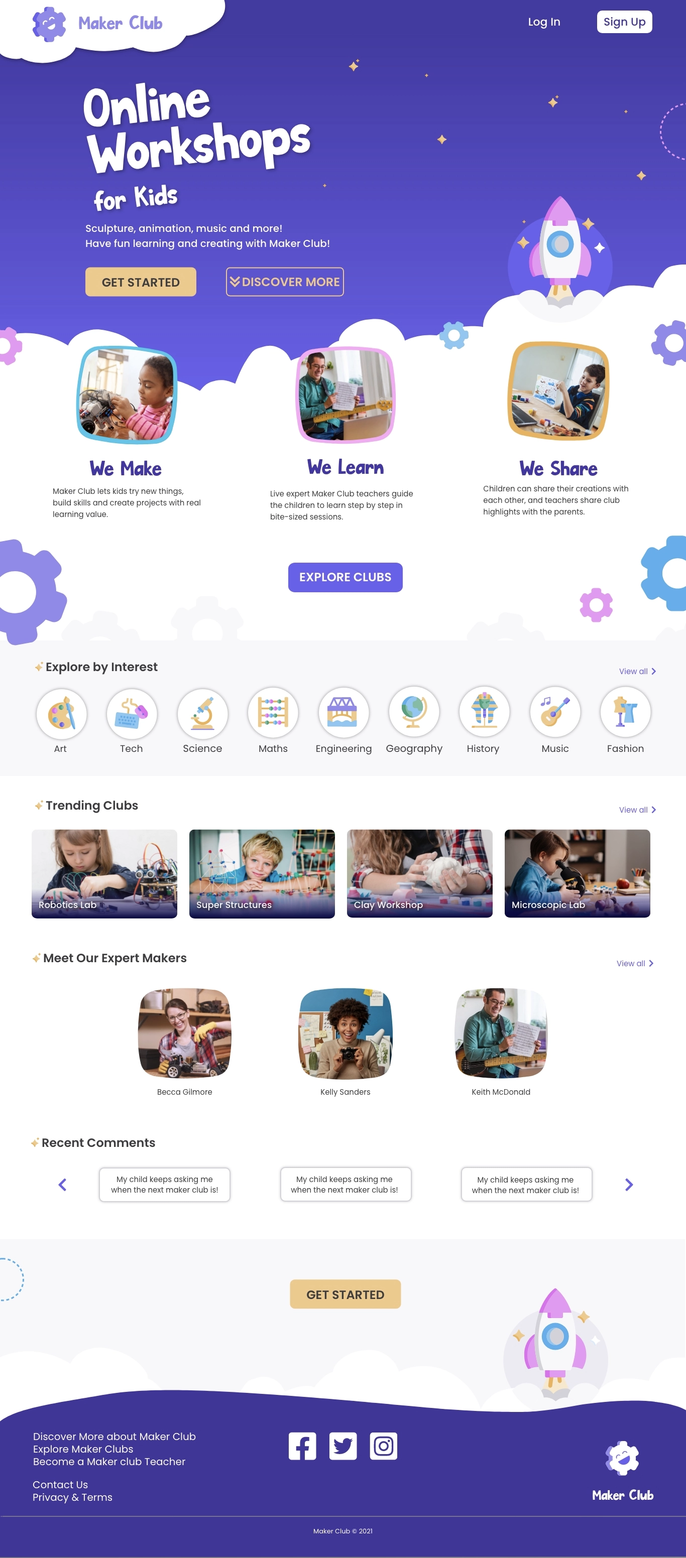
01 | Preview
Feature highlights
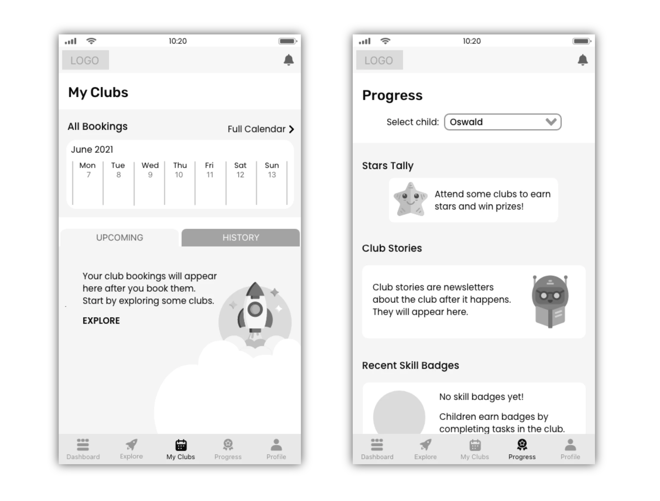
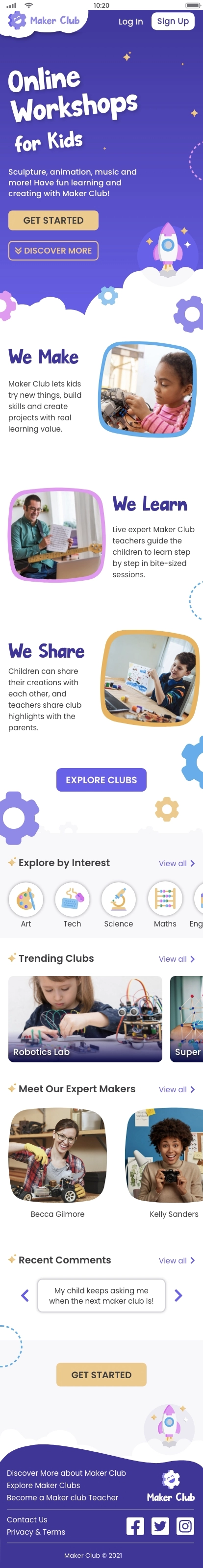
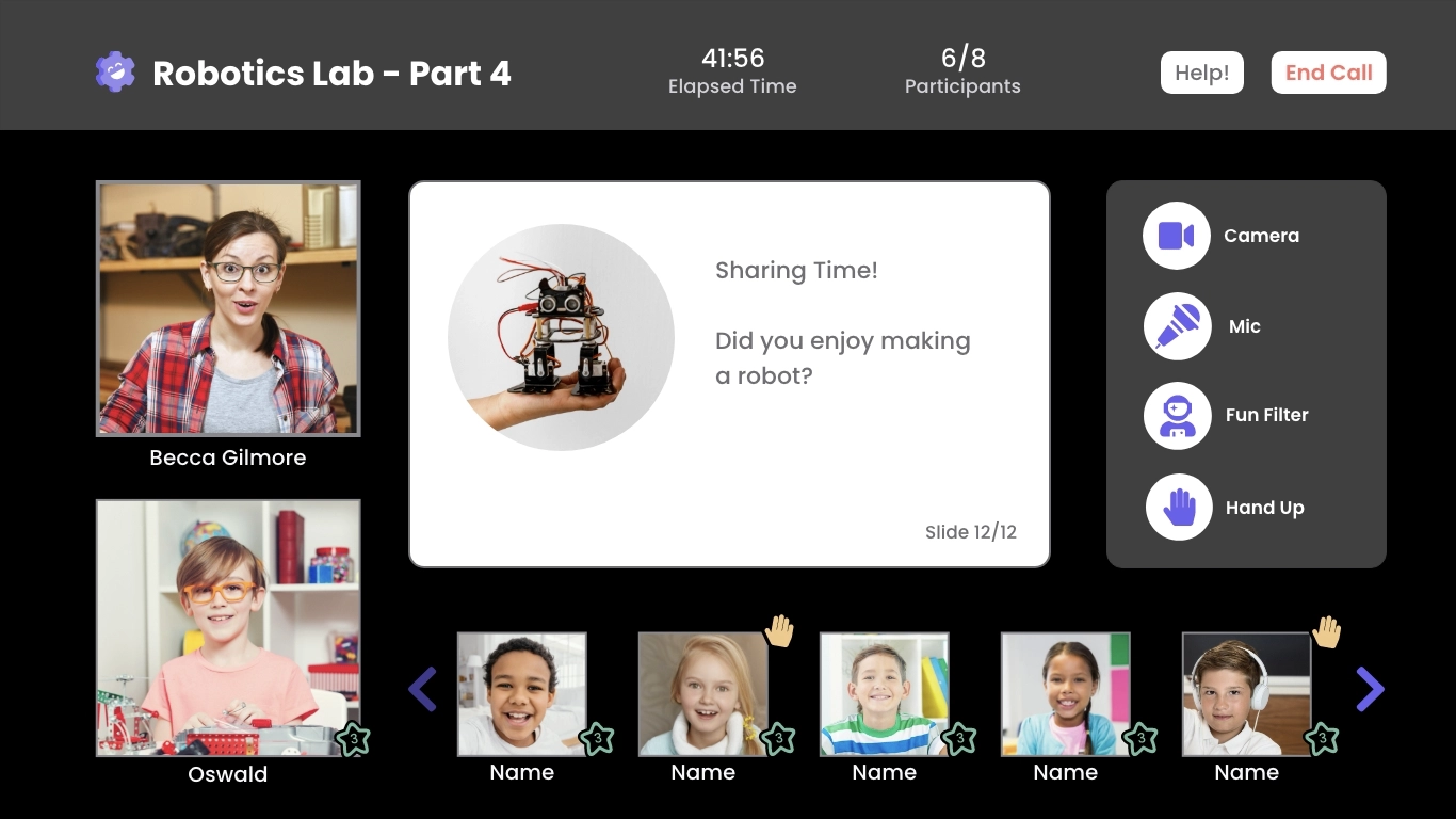
Here is a sneak preview of some final mockups to demonstrate the core features of this web app.

Workshops for kids
Build STEAM skills at home.

Find a workshop
Explore by time or subject.

In-app booking
Purchase workshops securely.

Get recommendations
Tailored suggestions.

Track progress
Collect stars and badges.

Expand horizons
Discover fun new topics.
02 | Introduction
Balloons & rockets
“Three, two, one… Blast off!” An excited child releases an inflated balloon, and it shoots across the classroom. The child dashes off to retrieve the balloon which is connected to a long piece of string. The other children cheer and beg the teacher to be the next one to try.
Learning by doing
It seems like a game, but it’s not. This simple science experiment demonstrates Newton’s third law of motion: for every action, there’s an equal and opposite reaction. Hands-on activities like this help children understand tough concepts about forces, including how rockets launch into space!
Skills shortage
In a rapidly-changing world, the demand for skills in the STEAM subjects (science, technology, engineering, arts, maths) continues to rise. Today’s children need tomorrow’s skills, and right now there’s an enormous skills shortage. Initiatives to fill this skill gap include after-school clubs and workshops, but these are not always available locally.

Online experts
My project began with a vision of online experts guiding children to develop new skills and learn through fun hands-on activities. Online language tutors use a tried-and-tested format of bite-sized interactive lessons, so why not have a similar approach to teach 21st century skills?
Today’s children need tomorrow’s skills.
Problem
At this early stage, I defined the problem at this stage.
- Parents need a way to book virtual clubs for their children and communicate directly with the experts because it’s important to get feedback about their child’s progress and to ensure that the child is developing useful skills during the club session.
- We will know this to be true when we see both experts and parents sign up for the app, experts meeting enrolment targets for their online clubs and parents posting positive reviews or ratings for the clubs.
Design process
I took several methods into consideration, including design thinking and the double diamond approaches, and combined these approaches to form a design process.

04 | Discover
Understanding the problem
Methods and tools
Competitive analysis
Qualitative research
Quantitative research
Survey tool
Video call tools
Competitive analysis
At this stage, a vision was forming in my mind, but I wasn’t sure what the competition looked like. I checked out a lot of websites and apps and quickly identified Outschool and ActivityHero as the big players of this niche and conducted a thorough analysis of these two web apps, including SWOT analysis.

I also examined smaller virtual activity providers, edtech products and apps with video and messaging functions and was surprised to observe that every virtual activity provider relied on external video-conferencing apps such as Zoom for the video call classes.
Every virtual activity provider relied on external video-conferencing apps such as Zoom for the video call classes.
Research: Meet the parents!
Although I have experience working with children, I’m not a parent myself, so it was essential for me to get into the mind of the potential users of this product: the parents. I was also interested about the perspective of the online teachers.
I decided to use a combination of methods to help deliver a range of results across the research spectrum: from quantitative to qualitative, attitudinal to behavioural.
21
Surveys
5
Interviews
23
Parents
9
Teachers
Research goals
To get the most out of the research, I set some goals:
- Get a better understanding of attitudes towards children doing skill-based learning activities virtually.
- Determine what factors encourage or deter parents/teachers from virtual activities.
- Get an idea of the context parents would enrol their child in virtual activities
- Find out what kind of support teachers need to conduct activities online and meet enrolment targets.
- Establish which features would be most beneficial.
To meet these goals, I conducted the following research:
Surveys
Quantitative research
I distributed a survey on Google Forms with screening questions to check for either parenting or teaching experience.
Interviews
Qualitative research
I wrote a script and then recruited five participants that matched the demographic. I conducted a 20-minute interview with each participant remotely using Skype or GoogleMeet.
Digital ethnography
Quantitative research
Due to pandemic restrictions, I couldn’t observe online classes conducted in person, but I gleaned a lot of information by watching videos and browsing related forums to get a sense of the conversations taking place.
05 | Analyse
Meeting user needs
Methods and tools
Affinity mapping
Personas
User journeys
User flows
Online whiteboard
Research reflections
I was afraid it would be difficult to get data because parents and teachers are such busy people, so I thought they wouldn’t have much time to talk to me.
I was wrong about that.
First of all, one of the interview participants actually had first-hand experience of booking online art classes with Outschool - the focus of my competitive analysis. Second, almost all of the research participants had experience of either parenting, working with children or both. Third, due to recent school closures, all participants had experienced online learning and everyone had lots to share about this topic.
“
The part where he had to take a picture of his art, upload it, that went totally fine. I showed him initially, like this is what you have to do, and then he was cruising!
-P3, father of one boy aged 10
“
I'm sure we would have signed up for more classes at Outschool if we had more information about them.
-P2, mother of two girls aged 6 & 11
“
Yes, you have the teacher, but you should also have something like the activity box. If they have to do something and show it, they will be very proud.
-P1, mother of two boys aged 6 & 11
Making sense of the data
I accumulated more data than I had anticipated as the surveys also yielded many comments. I looked for patterns using affinity mapping. Several clusters emerged regarding the practicality of children's use of video calls for learning and various pros and cons of virtual classes. A couple of clusters caught my attention: engagement and off-screen activities.
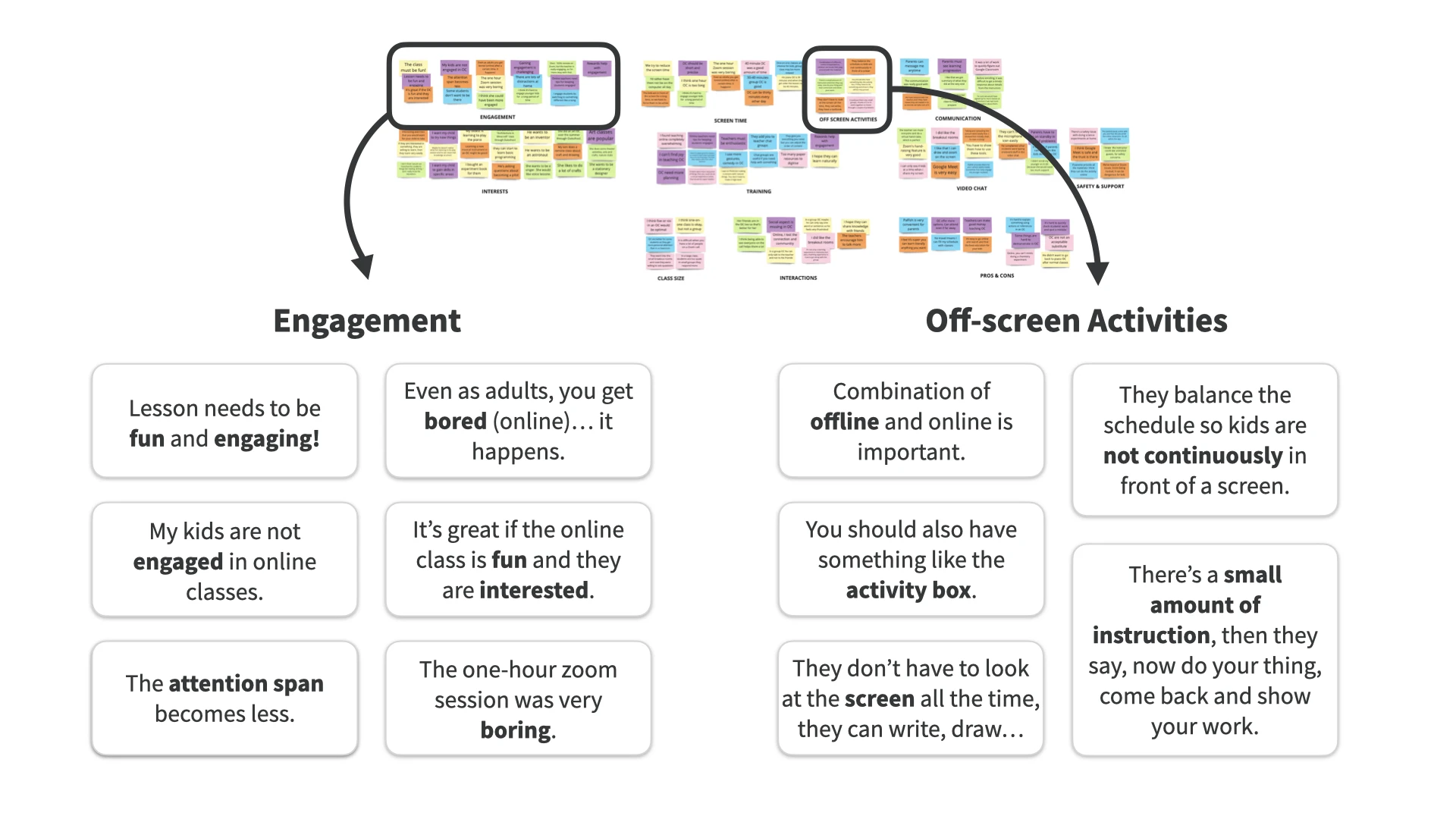
Insights
- Parents are open to online learning for their children, as they already have some experience of virtual learning due to recent school closures.
- Parents raised issues of screen fatigue and the importance of active learning - not just watching the screen passively, but doing an activity. Lack of engagement is a major concern for both teachers and parents.
- Essential features include class listings and teacher bios, ability to search, filter, find and book online classes.
- Online teaching is challenging and there are several areas for improvement. Changing the format from classroom instruction is necessary and teachers need support and resources.
Parents raised issues of screen fatigue and the importance of active learning - not just watching the screen passively, but doing an activity.
Focus on the user
Brenda, Clive and Kelly
Using personas, I humanised the data, creating fictional parents who represent key insights. These personas highlight user motivations, needs, and frustrations, with one also acting as a teacher.
View personas in full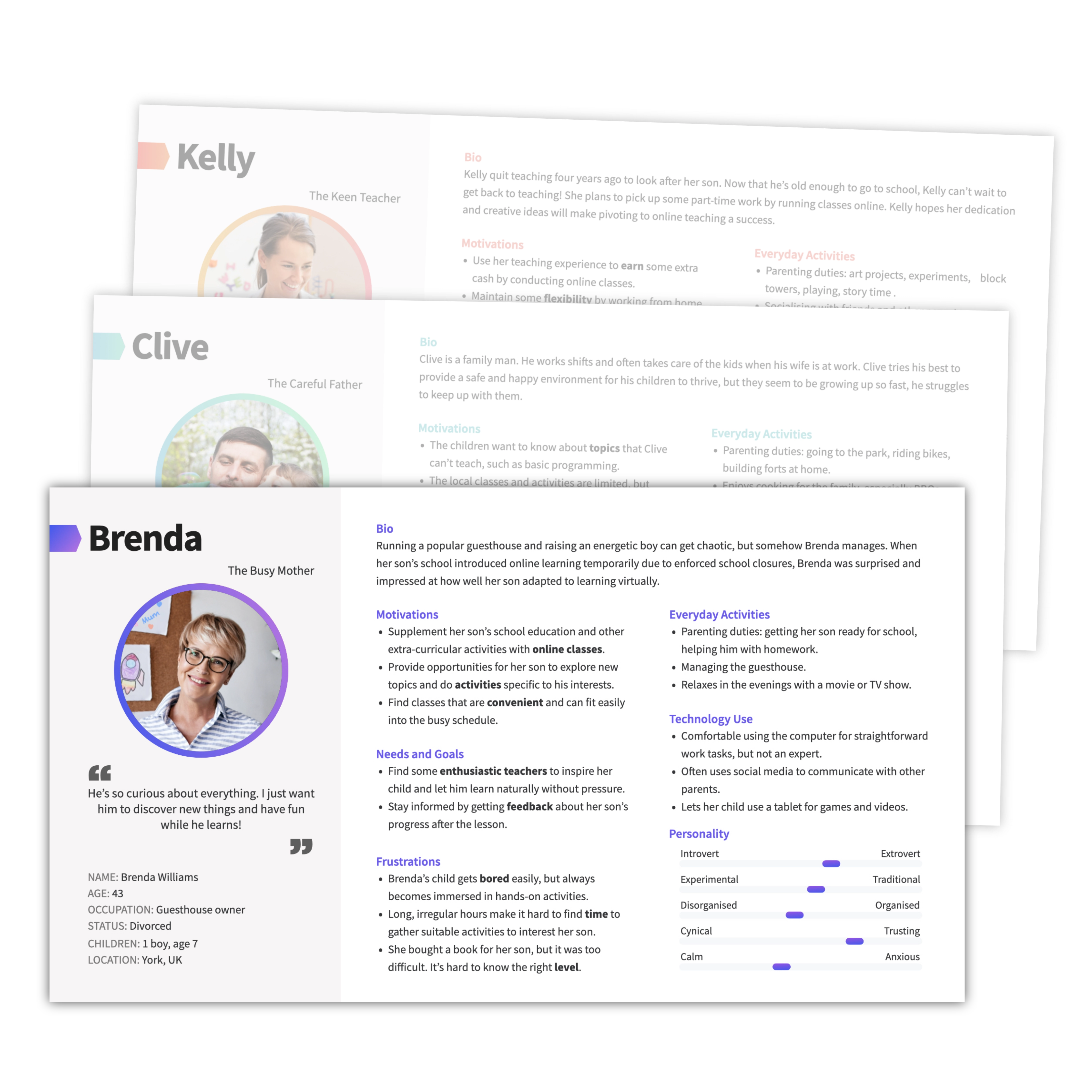
User journeys
Each persona has different needs and perspectives, so I created user journeys for each persona. These document the tasks, thoughts and emotions for each user as they move towards completing a defined goal. These user journeys help us understand where they might face frustration or difficulty, but can also highlight possible opportunities for solutions and other useful features that enhance the app.
View user journeys in full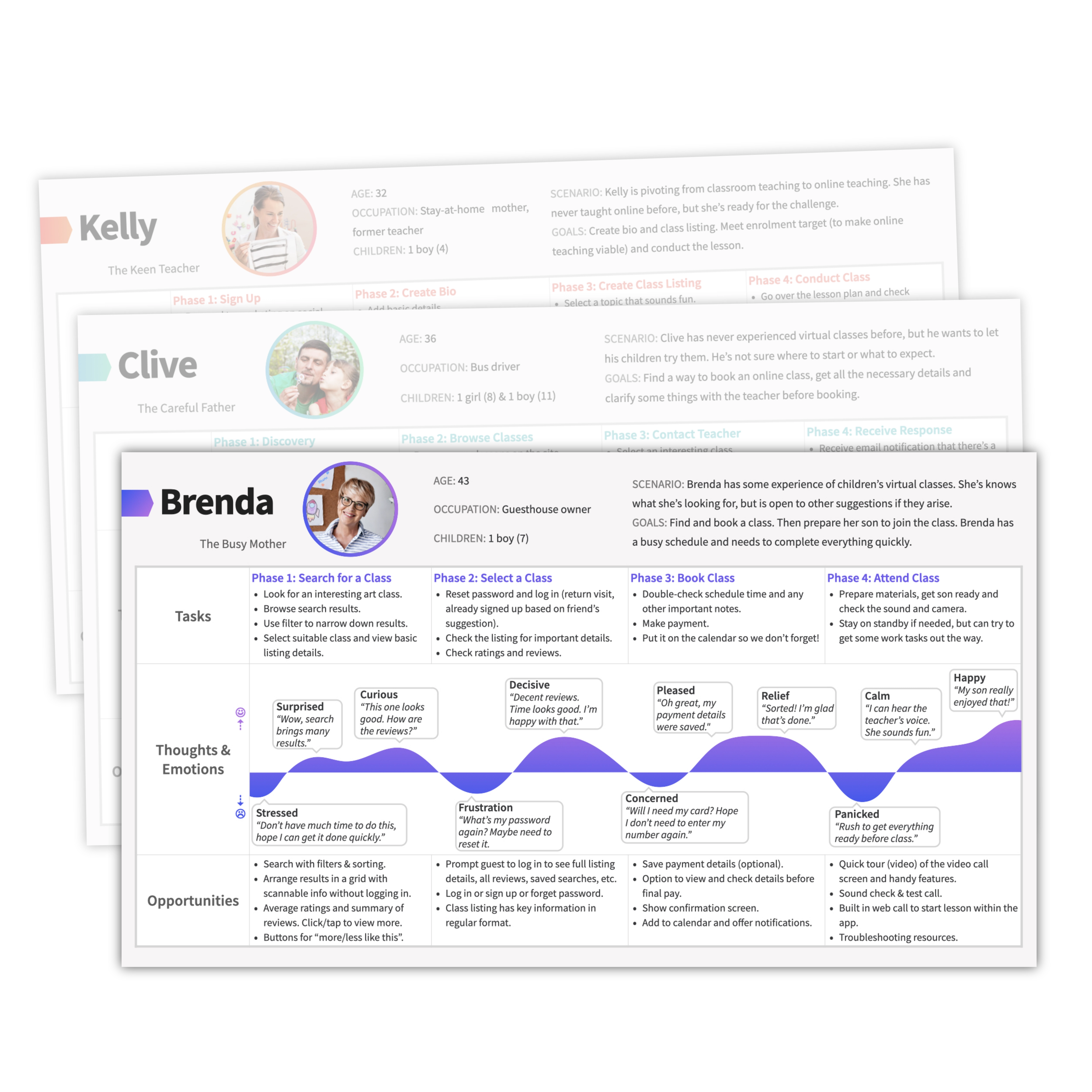
User flows
I created user flows for each persona to show the procedures to complete a task.
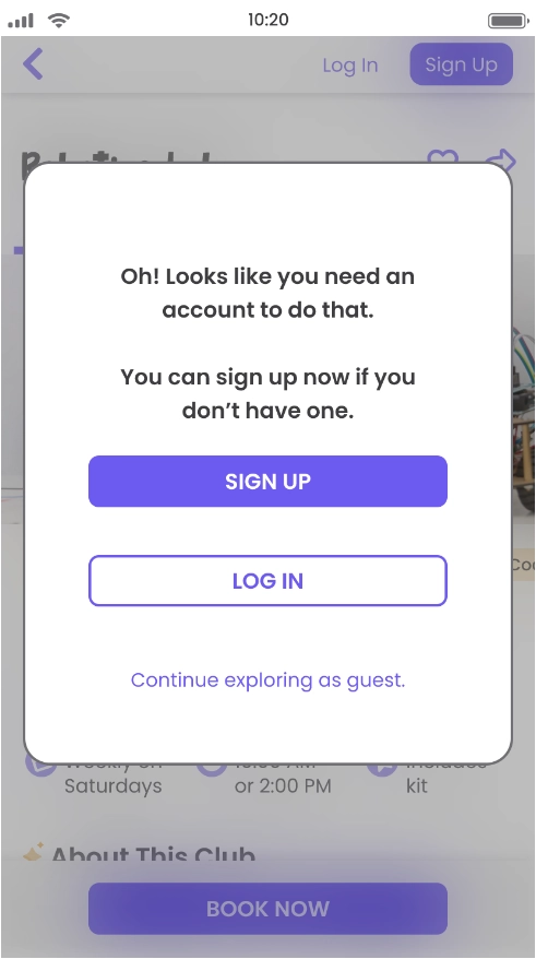
Guest access
Problem: Forcing users to sign up immediately without providing enough information about the service is off-putting, but it's necessary to have an account to access bookings.
Solution: Parts of the site have guest access and users will see prompts to log in / sign up when they want to make a booking. This can be seen in the full version of the user flow.
View user flows in fullScope for the MVP
To narrow the scope for the MVP, I came back to primary persona, and decided to focus more on her needs. That meant separating the project into two platforms: one for parents and one for teachers. Now I could base the MVP on the needs of the parents and focus on this platform. I will come back to the teacher's platform later (see Evolve).

Core features
In addition to landing and onboarding, I selected three core features based on the personas' main tasks and created some user stories:
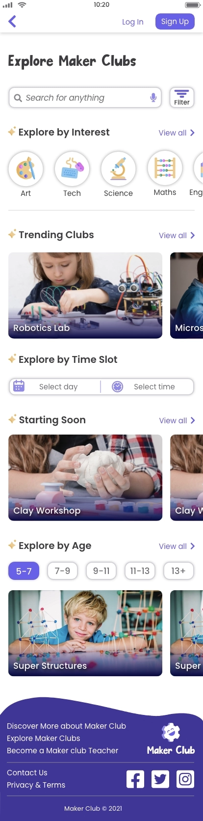
Search and book
As a parent, I want to search for club listings using filters and browse the results, so that I can find suitable virtual clubs and activities for my child to join.
Video call
As a parent, I want to join lessons through a built-in video chat platform, so that I can avoid using external sites which require inputting meeting room codes and passwords.
Club feedback
As a parent, I want to view feedback from the teacher after the club, so that I can stay updated about what my child learned during the club sessions.
06 | Develop
Building the solution
Methods and tools
Information architecture
Card sorting
Sketching
Wireframing & prototyping
Online whiteboard
Testing tool
Pen and paper
Design tool
Sitemap and card sorting
I made several decisions during the sitemap stage–see sitemap annotations below.
After designing the sitemap, I revised it based on card sorting results from six participants. Generating a similarity matrix from the results highlighted topics that participants expected to see grouped. For example, I originally put the Club Highlights (feedback about a recent club by the teacher) with messages because I felt it was a kind of communication, but card sorting revealed participants expected this to be grouped with progress or achievements.

Lo-fi wireframes
Quick sketches
I created basic wireframes for core features using user flows as my guide. I explored layouts and information flows for mobile and desktop screens. During the sketching process, I noticed inconsistencies in the initial plan. To address this, I split one wireframe into two parts and updated the navigation and sitemap. Early detection and rectification of these issues helped prevent complications as I continued refining the wireframes.

Empty states for onboarding
As I digitised the sketches, I noticed some areas lacked content, like upcoming bookings for new users. These empty areas serve as onboarding prompts, guiding users to explore and book clubs. Informational cues are included for clarity.
User testing procedure
Once I had a high-fidelity prototype ready, I needed to put it to the test. I created a test plan to conduct remote moderated usability test sessions so that I could make use of live-conferencing tools such as screen sharing and record the sessions. I made use of the following techniques:
Planning the tests
- Set goals and objectives based on overall learnability and the core feature tasks.
- Write script including scenarios to help participants visualise each situation.
- Recruit participants screened to fit with personas (have parenting experience).
Conducting the tests
- Six participants completed the usability testing.
- I recorded the sessions to that I could obtain transcript notes (what participants said) and observations (what participants did).
Methodology and metrics
- Affinity mapping in Miro to group transcript notes and observations.
- SEQ (single ease question) to quantify participants' sense of task difficulty.
- Jakob Nielson error scale to rate severity of issues.
- Rainbow spreadsheet to condense notes and brainstorm solutions.
Analysis, insights & updates
Analysis of the data unearthed some interesting insights. Among the tasks, searching and filtering for a club received the lowest SEQ rating and the comments indicated usability issues.
Insight: Testing revealed a big difference between search and filter approaches, such as searching for a product on e-commerce sites, but on this type of app parents prefer to filter by time or age group and then browse to see what’s available.
Usability testing helped me understand how the users were approaching the tasks and what they were thinking and expecting. I also ran a preference test on UsabilityHub to find out which screen design people preferred.

07 | Deliver
High-fidelity wireframes
Methods and tools
Design language
Peer review
Wireframing & prototyping
Contrast checker
Video editing tool
(iMovie)
Design tool
(AdobeXD)
Makeover time
Now it's time to add branding, colour, imagery and flair to the high-fidelity prototype. I paid special attention to Gestalt psychology, hierarchy and other design principles.
Responsive layout
I focused on mobile pages, but also designed some desktop pages to demonstrate the responsive layout. I used a grid system (12 columns for desktop) to keep the page neat and orderly but also add interest by switching up the presentation of elements.
Peer review
I received over 50 comments about the design on a shared link to the prototype which provided valuable input.

UI patterns
When iterating, I considered established UI patterns and tested out different ideas. I added more visual elements such as icons and grids to make the information easier to digest.
I implemented options for the user to interact with the page, such as tab bars, horizontal scrolling groups and floating action buttons, which ultimately led to the solutions seen in the highest-fidelity version.

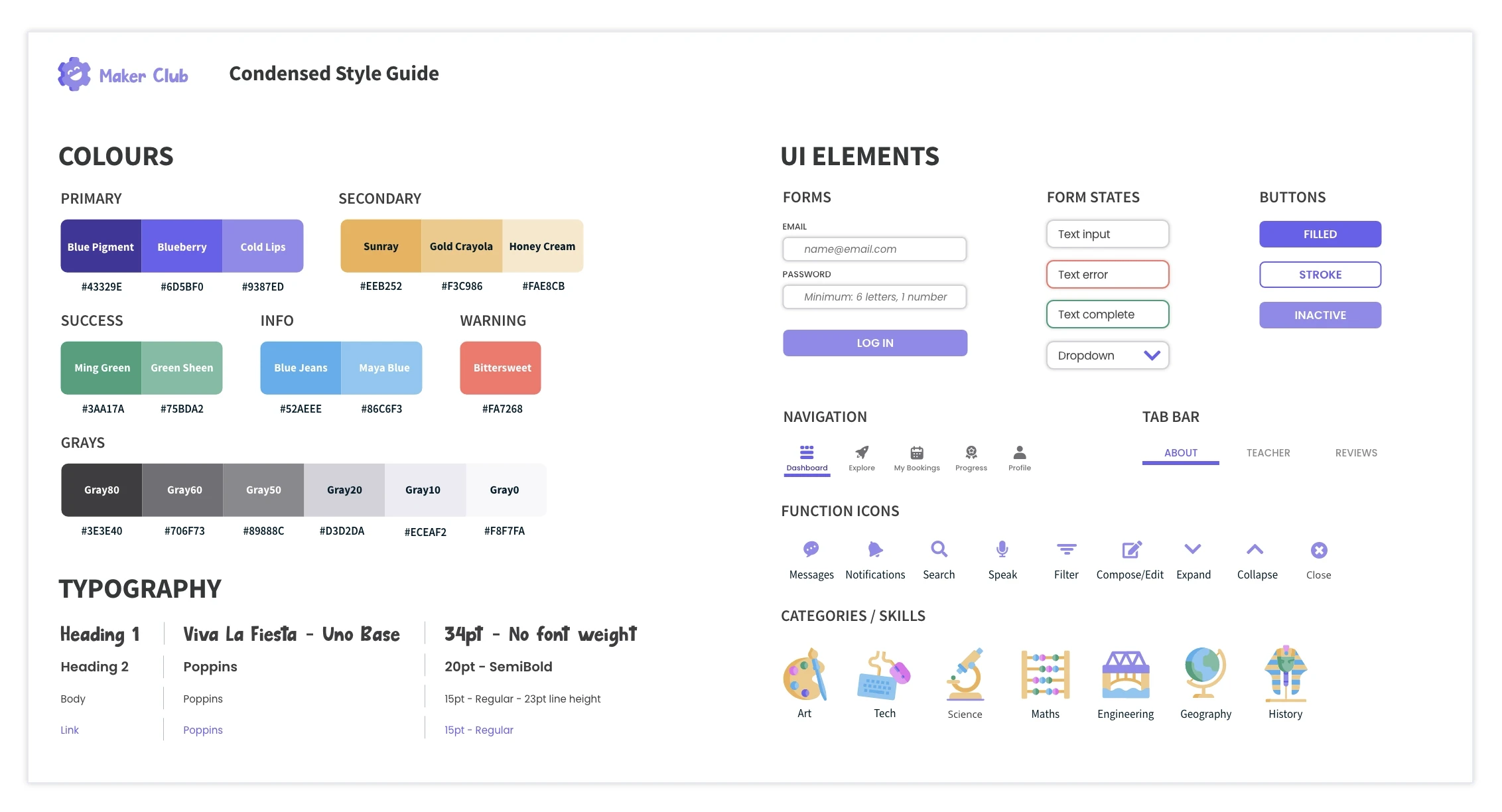
Style guide
I developed a style guide and expanded design language to communicate all the colours, typography and other UI elements used in the prototype. A condensed version of this is below.
Accessibility
Accessibility principles and guidelines are integrated into the design so that the product can be used by everyone, including those with vision impairments or motor impairments.
I also considered the children as users, as they may need to use some functions during the video call. I made these buttons large and kid-friendly.

UI gallery
Check out some examples of the UI below - some are scrollable. The next part includes a clickable prototype where you can interact with the entire design.
SCROLL
SCROLL


SCROLL
SCROLL
SCROLL

SCROLL
SCROLL
SCROLL
Clickable prototype
Access the clickable prototype for Maker Club below. You can also view the prototype directly in AdobeXD here, which has comments from peer review.
08 | Evolve
Next steps
The prototype and deliverables provide a solution to the initial problem. It's a work in progress and the minimum viable product has areas for expansion. I would like to add the platform for teachers as this is something I would be excited to develop in the future due to my background working in education.
Reflections
My project promotes the concept of learning by doing, and this is also how I developed an understanding of UX principles and procedures. I learned how to use a lot of new tools and now have proficiency using AdobeXD to create complex prototypes with component states.
From years of working in educational publishing, I'm familiar with a similar approach to the design process. We start with a blank slate, explore the problem, narrow down the ideas, and then develop the plan and content. The result is a solution: the finished product.
Throughout the design procedure, there are countless changes, so it's important to be flexible and adapt quickly to every new direction or vision. After all, there are always improvements to be made and voices to be heard. Considering these different perspectives is essential to achieve the end goal of providing a successful user experience.
Design credits: I created many of the graphics in the prototype and on this page, but I also used some some icons and images from www.freepik.com.


